
Typography is the art of making written language visible. In a book, it is the single most important design decision, because a book is mostly type. The choice of a typeface, its size, the space between its lines, the length of its lines and the way that headings differ from text decide whether a page is a pleasure to read or a chore. A reader who has never heard the word typography will still feel it, and will say, if asked, that a book was easy or hard to read. Book typography design is the craft of making it easy.
Book Typography Design · from $239
Book typography design that helps readers stay in the story
Book typography design is the craft of choosing and setting the type so that reading feels effortless: the typeface, the size, the line spacing, the measure and the way headings and text relate to each other. Our book typography design services select and set type for your genre, then deliver a print-ready interior and an ebook that both follow the same typographic system. Pick a word count to see your price for your own book.
View Pricing
Most typography projects are ready in about a week.
- Fonts chosen for your genre and readers
- Body size and leading tested in print
- Print and ebook typography matched
Key facts
- $239Starting price for the book typography, before extras
- 2 roundsOf revisions included in every book typography order
- 2 to 3 daysFastest standard delivery for a short book typography
Overview
What a book typography actually involves
People often ask about the types of typography in graphic design. The broad families are serif, with small strokes at the ends of letters, which suit long text in print; sans serif, without those strokes, which suit headings, captions and screens; slab serif, with heavy rectangular serifs, which suit display and some children's books; script, which imitates handwriting and suits short display text; and display faces, made for large sizes. The rules of typography in graphic design are as much about restraint as about choice: use few faces, use a clear hierarchy, keep line length between about 45 and 75 characters, give lines enough leading, avoid all-caps for long text and never stretch type.
Our typography service applies these rules to your book. We choose a body face that suits the genre and the reader, pair it with a display face, set the size and leading, define the heading hierarchy, treat numerals, small caps and ligatures correctly and test the type on sample pages. We also prepare the type for ebooks, where the reader controls the face and size. If you want to learn more, the best books on typography include Robert Bringhurst's The Elements of Typographic Style, Ellen Lupton's Thinking with Type and Jost Hochuli's Detail in Typography. If you would rather have the work done, the price is fixed and shown in the calculator.
We start every book typography design job with an audit. We open your file or manuscript, list what is already right, what is wrong and what needs a decision from you, and send that back before any work begins on this book typography project. The audit is why there are no surprises: you know the scope, the price and the schedule, and you know which of typeface pairing and size and leading is likely to need the most care.
Authors often ask how to choose a font for a novel, and the honest answer is to pick a readable serif at a comfortable size, set it with generous leading and test it on a printed proof.
Why it matters
Why a book typography matters
Book typography design shapes the reading experience
Readers respond to type before they read, and the right face sets expectations for the genre. Readers rarely name the cause, but they feel the difference between careful and careless book typography design work.
The details carry the quality
A poor pairing makes a book look amateur, even when everything else is correct. Each detail in book typography design has a tolerance, and a professional knows where it lies and how to check it.
Doing it once, properly, saves time
Licensing matters: not every font can be embedded in print and ebook. Getting book typography design right at the start also keeps later edits, reprints and new editions inexpensive. It is far easier to get book typography design right while the book is still a working file than to repair it after publication.
Book typography rules for print
The rules of typography applied to books
If you have searched for the rules of typography in graphic design or the types of typography in graphic design, such as serif, sans serif, slab, script and display, this is how those ideas apply to a book. For long reading, a text typeface with moderate contrast, open letterforms and a steady colour is the foundation, and everything else supports it.
We set the body at a size and line spacing that suit your trim and your readers, then give headings a clear relationship to the text through size, weight and space rather than decoration. We follow the book typography rules for print that experienced designers rely on: a comfortable measure of roughly forty-five to seventy-five characters, a modest first-line indent, restrained use of capitals and consistent treatment of every element.
Readers who want to learn more often ask about the best books on typography design. A frequently recommended classic is The Elements of Typographic Style by Robert Bringhurst, and our work follows the same principles of clarity and proportion. Graphic design typography examples are useful for display work, but long-form book text rewards restraint above all.
- A text typeface chosen for long reading and your genre
- Body size, leading and measure set together and tested in print
- Headings and special elements related to the text by scale and space
Choose the right build
The first decision in any book typography
Classic book typography
Traditional serifs with careful spacing. It suits fiction and history. We choose this route when the book leans on typeface pairing, and we show a sample before the whole book typography design job proceeds.
Contemporary book typography
Clean sans-serif or modern serif pairing. It suits business and lifestyle books. We choose this route when size and leading are central to how the book is used, and we explain the cost and schedule consequences before you commit.
Specification
The book typography specification we build to
These are the decisions we make on every book typography job, and the reason for each one.
Element
How we build it
Why it matters
Pairing
One serif body face with a contrasting display face. We confirm the value with you before building, and record it in the specification for your book typography design job.
Contrast without clash. Getting this right early avoids rework once the book typography design pages have been proofed.
Scale
A modular scale for headings and captions. We apply it through a defined style or setting, so it holds across the whole book typography design file.
Hierarchy is clear. On this book typography job, readers and reviewers notice when it is wrong, even when they cannot say what is wrong.
Details
Old-style figures, ligatures and small caps where appropriate. We verify it again in the final proof, because it is easy to disturb during late edits on this book typography project.
Refinement. Platforms and printers check it automatically, and a failure delays the launch with your book typography.
Licence
Print and ebook embedding rights confirmed. For your book typography, where your platform sets a different rule, we follow the platform and tell you why.
Avoids legal and rejection issues. It also keeps later editions of the book typography design work consistent with the first.
Files
A type specification, licensed font recommendations and a styled interior PDF, named consistently and delivered with a short specification.
For a book typography, a clear package prevents mix-ups between versions and speeds up any later change. Getting this right early avoids rework once the book typography design pages have been proofed.
Checks
Preflight or validation run on every deliverable, with the report supplied for the book typography. We apply it through a defined style or setting, so it holds across the whole book typography design file.
With your book typography, evidence of a clean pass is what separates a checked file from a hopeful one. On this book typography job, readers and reviewers notice when it is wrong, even when they cannot say what is wrong.
See what it costs
See the price of your book typography in a minute
Choose a word count and see the price of book typography design for your own book, with delivery time and extras, before you commit to anything.
Build my priceProcess
How a book typography project runs
Send
You send the files and tell us what you need from the book typography design job, including where you plan to publish and any deadline. We confirm the scope and the price on this book typography project. You are never left guessing what comes next, because we confirm each stage of the book typography design job in writing.
Day 1
Audit
For a book typography, we examine the file, list what is correct and what must change, and send a short note with any decisions we need from you. If something unexpected turns up at this stage, we tell you at once and agree the fix before continuing with your book typography.
Days 1 to 2
Plan
We agree the specification, including how we will treat typeface pairing and size and leading, and confirm the schedule. For a book typography, this stage is where most questions arise, so we leave time for them in the schedule.
Day 2
Build
We carry out the work, applying defined styles and settings, and fixing faults at their source rather than covering them for the book typography. You are never left guessing what comes next, because we confirm each stage of the book typography design job in writing.
Days 3 to 7
Check
We validate, preview and review the result against the specification, and compare the text with your manuscript for the book typography. If something unexpected turns up at this stage, we tell you at once and agree the fix before continuing with your book typography.
Days 8 to 9
Deliver
You receive the files, the specification and the change log, with support if a platform queries the file with your book typography. For a book typography, this stage is where most questions arise, so we leave time for them in the schedule.
Day 10
Before and after
Typography before and after
The same page set with default typography and with a considered choice. The words are the same, but the second page is calmer and more inviting.
123Before
- 1A default system font at a size that was never tested
- 2Lines packed too tightly with a long measure
- 3Headings and body that look almost the same
123After
- 1A text typeface chosen for the genre and tested in print
- 2Size, leading and measure balanced for easy reading
- 3Headings set with clear contrast and space
- 3problems found in the first review
- 3fixes checked in the final review
- 1named specialist owning every fix
- Fixedprice confirmed in the calculator before you order
Easier reading
Readers move through the pages without noticing the type.
A genre-fit voice
The type tells the reader what kind of book this is before the first sentence.
Consistency across formats
Print and ebook share one typographic character.
Pricing calculator
Build your book typography price
Typography gives a book its voice: the typeface, the size, the spacing and the way lines are broken. Describe your manuscript, choose the editions and see a fixed price for a typographic design that suits it.
Beyond our online limit? Let us quote it properly.
A text over 150,000 words or a book with more than 150 images has individual typographic needs and is priced separately. Send the details and we reply with a fixed price and date.
Your price covers the typographic design and its application to the interior. Font licences beyond the families we supply, printing and ISBN fees are not included.
Price guide
Book Typography Design cost at a glance
This table shows book typography design pricing at each length, with the base price, delivery window and the kind of book that fits. The calculator adds editions and extras to your book typography for an exact total.
Word count
Base price
Standard delivery
Typical book
Very short text
$239
2-3 working days
Very short text
Short text
$289
3-4 working days
Short text
Compact text
$369
3-5 working days
Compact text
Short book
$449
4-6 working days
Short book
Standard length
$529
5-7 working days
Standard length
Full-length text
$609
5-8 working days
Full-length text
Long text
$689
6-9 working days
Long text
Large text
$769
7-10 working days
Large text
Longest online length
$849
8-11 working days
Longest online length
More than 150,000 words
Custom quote
Agreed with your quote
Quoted individually
Comparison
Book Typography Design compared with the alternatives
What you compare
A quick book typography design fix
Professional book typography design
Approach
A quick fix treats symptoms and leaves the cause in the file in this book typography order. That approach saves effort at the start and tends to cost more in repairs once the book typography design job is live.
A professional book typography design job finds and corrects the cause. We do this as standard on every book typography design job, and the evidence comes with your files.
Consistency
Manual changes vary from page to page for the book typography. For your book typography, it leaves the cause in place, so the same fault tends to return when the text changes.
Defined styles apply identically everywhere. It is built to be repeated, so later editions cost less and match the first in this book typography order.
Validation
For your book typography, success is judged by eye on one screen. It is hard to check, so faults are usually found by readers instead of by the author with your book typography.
Success is judged by the platform's own checks and real devices for the book typography. It is checked by a person and by software before it reaches you, so problems are found early for the book typography.
Documentation
With your book typography, nothing is recorded, so the next edition starts again. That approach saves effort at the start and tends to cost more in repairs once the book typography design job is live.
A specification and change log are supplied for the book typography. We do this as standard on every book typography design job, and the evidence comes with your files.
Risk
For your book typography, a rejected upload costs days and may delay a launch. For your book typography, it leaves the cause in place, so the same fault tends to return when the text changes.
With your book typography, files are tested before they reach you, and fixes are covered by the guarantee.
Cost
Cheap at first, then repeated whenever something changes on this book typography project. It is hard to check, so faults are usually found by readers instead of by the author with your book typography.
For your book typography, a fixed price and a reusable result. It is checked by a person and by software before it reaches you, so problems are found early for the book typography.
Portfolio
Book typography portfolio
Finished examples of Book Typography Design work from our portfolio, each one built for a real book.
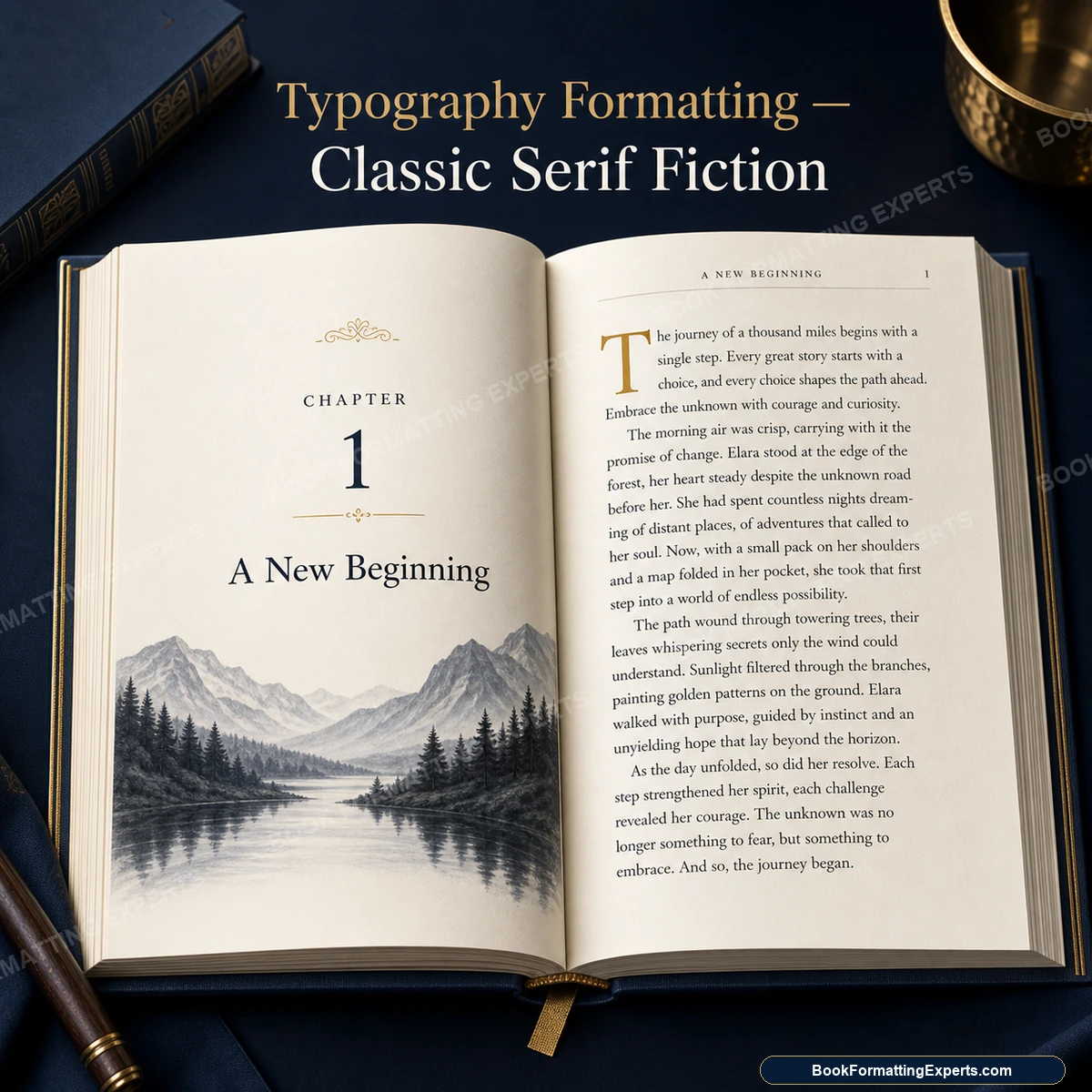
Classic Serif Fiction
A finished Classic Serif Fiction example from our Book Typography Design work.
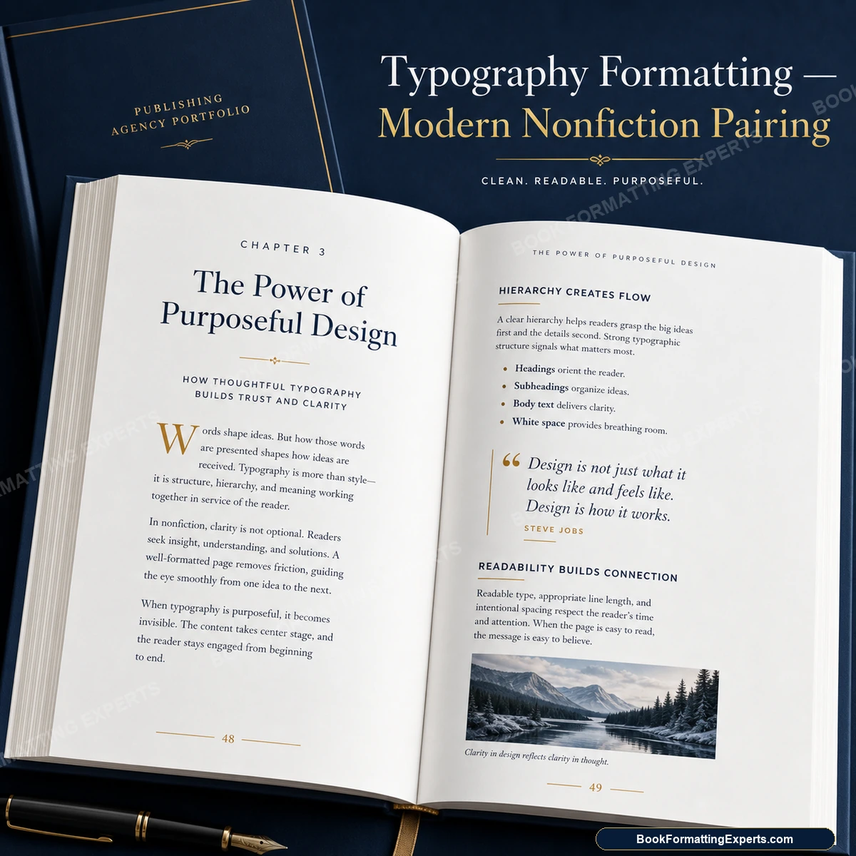
Modern Nonfiction Pairing
A finished Modern Nonfiction Pairing example from our Book Typography Design work.
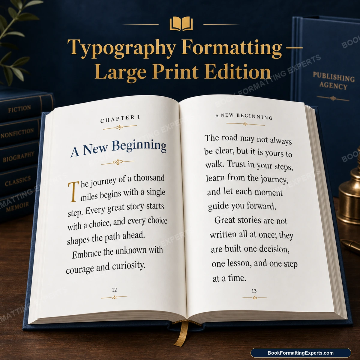
Large Print Typography
A finished Large Print Typography example from our Book Typography Design work.
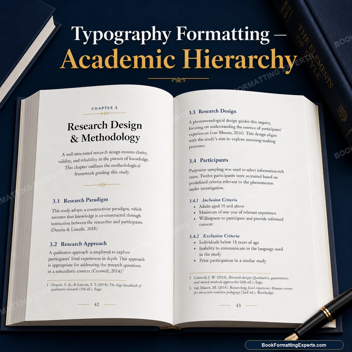
Academic Hierarchy
A finished Academic Hierarchy example from our Book Typography Design work.
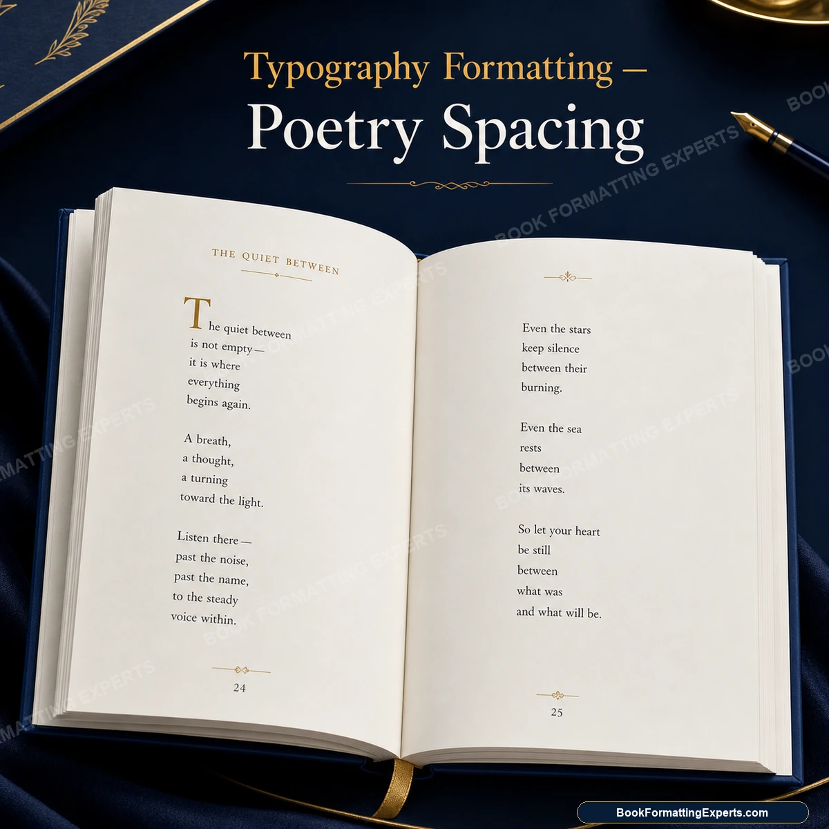
Poetry Spacing
A finished Poetry Spacing example from our Book Typography Design work.
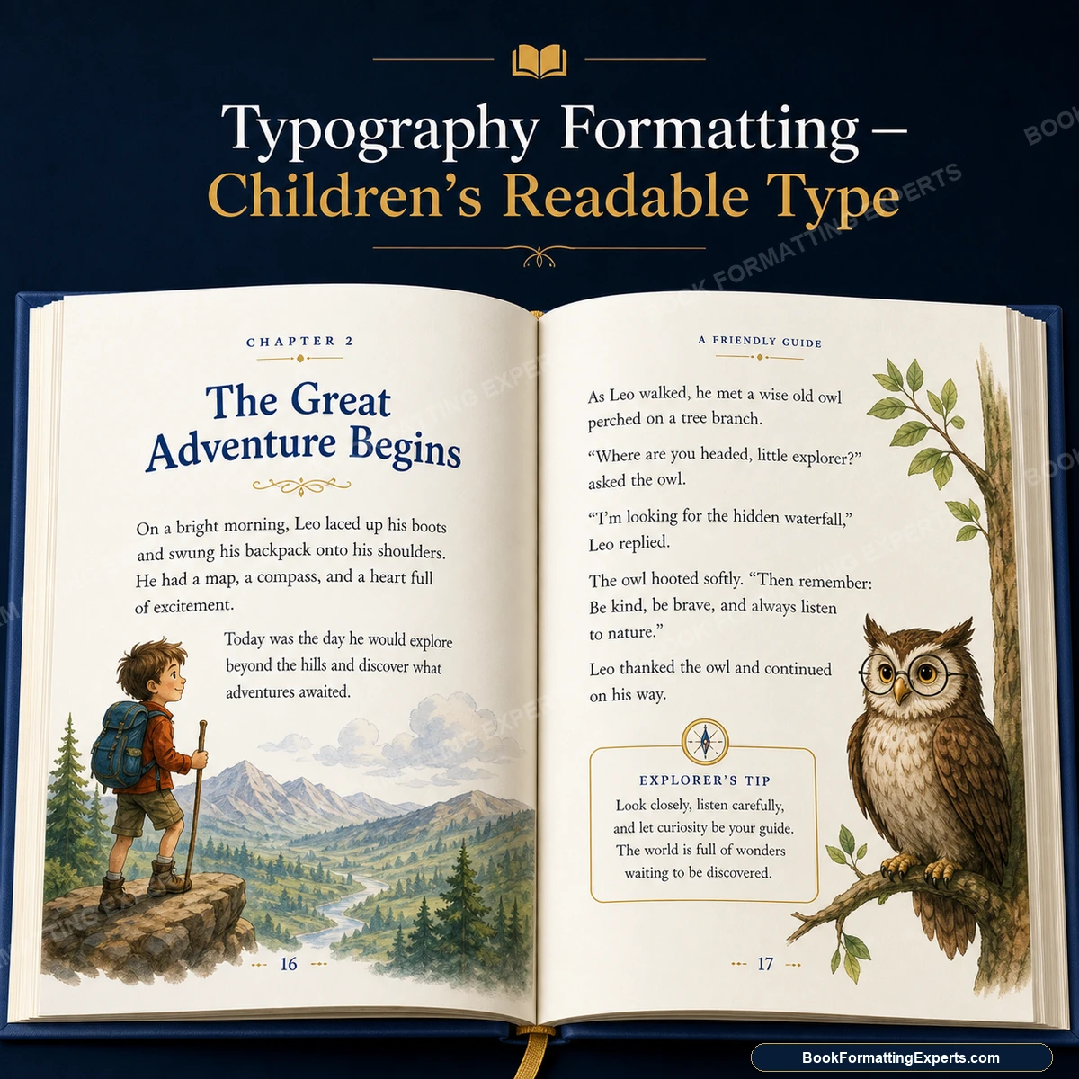
Children's Readable Type
A finished Children's Readable Type example from our Book Typography Design work.
Our standard
The standard we hold every book typography to
Fix causes, not symptoms
Our book typography design work corrects the underlying structure, so the same problem does not return when the text changes. It is a standard we hold on every book typography design job, whatever the price of the package or the length of the book.
Evidence over assurance
For your book typography, we supply the validation or preflight report with your files, so a clean result is something you can see. With your book typography, you can check it for yourself, because the evidence comes with your files. For a book typography, holding to it costs us time, and it saves you the cost of repairs later.
Plain communication
We explain what we found and what we did in plain language, and we tell you honestly when something is outside what the file can support with your book typography. For a book typography, holding to it costs us time, and it saves you the cost of repairs later.
Checklist
The pre-delivery checklist for a book typography
Every item below is verified on your book typography before it leaves our desk.
- Audit completed and agreed with you
- Typeface pairing checked and corrected
- Size and leading checked and corrected
- Display type and headings checked and corrected
- Special characters and figures checked and corrected
- Validation or preflight run with the report supplied
- Previewer and device checks completed
- Text compared with the approved manuscript
- Specification and change log delivered
How we think
How we think about your book typography
Structure first
In book typography design, typeface pairing and size and leading are built into the file, not painted on top. We treat structure as the foundation and appearance as the finish, because structure is what survives edits and platform changes on this book typography project.
Checked, not hoped
For your book typography, a file is not finished because it looks right on our screen. For a book typography, it is finished when the validator, the preflight and real devices agree, and when we can show you the evidence. It is the principle behind most of what we do on book typography design, and the reason we prefer to explain our choices rather than hide them.
Your files stay yours
We deliver source files and a specification, and we never lock your book typography design work inside a proprietary format. For a book typography, if you hire someone else later, they can pick up where we stopped. It is the principle behind most of what we do on book typography design, and the reason we prefer to explain our choices rather than hide them.
Client reviews
What authors say about our typographic work
Verified reviews from authors whose books were praised for readable, well-chosen type and careful layout.
Getting the layout right for a picture book is genuinely difficult. The page proportions, text placement, and illustration spaces were all handled with real skill. My publisher was impressed by the result.
I had tried formatting my manuscript myself twice before. The result was always messy. Book Formatting Experts delivered a clean, professional interior in under a week that passed KDP review immediately.
The bleed formatting on my picture book was handled exactly right. The full-colour spreads print edge to edge without any white borders. The final book looks like it came from a major publisher.
Good quality work. The interior looked professional and the file passed KDP without issues. One revision round was needed for some heading spacing but it was fixed quickly and without any fuss.
Cookbook formatting is a specialised skill. The recipe layouts, ingredient column alignment, and index were all formatted beautifully. The food photography placement looks professional and the page flow is logical.
My business book had 14 chapters, 38 tables, and 22 figures. Everything was formatted cleanly and consistently. The specialist flagged two source document errors I had not noticed. Thorough and professional.
My cookbook had complex multi-column layouts and metric conversions. The formatting handled every element cleanly. One revision to tighten the index and it was exactly right. A professional result.
Good formatting work. The tables and callout boxes were handled well. The delivery was a day later than the quoted date but the quality was exactly right and the file passed IngramSpark first attempt.
My romance novel needed a warm, readable layout with consistent chapter styling. The specialist understood exactly what I was after and the finished file exceeded my expectations on every page.
Every intentional white space, line break, and stanza pause survived the formatting process exactly as I had written them. Poetry is where formatting can make or break the reading experience. This got it right.
My self-help book needed a layout that felt warm and approachable without losing professionalism. The chapter openings, pull quotes, and action steps all worked visually together. Readers have commented on how easy it is to work through.
Every genre convention was applied correctly. The chapter openers, the dedication page, and the acknowledgements all flowed naturally. Readers have complimented how comfortable the book feels to read.
The devotional layout needed daily readings, scripture references, and reflection prompts to work together without feeling cluttered. The specialist understood the format immediately and the result serves the purpose perfectly.
The interior was formatted cleanly and the file passed KDP without corrections. I had one request during revisions about the callout box styling and it was updated promptly. Overall a good experience.
Fantasy books need careful layout to handle maps, epigraphs, and chapter artwork. Every element was handled with real understanding of the genre. The final interior is exactly what a fantasy reader expects.
The interior design reflects the purpose of the book — accessible, warm, and inviting for daily reading. The scripture placement and reflection boxes are formatted consistently throughout. I am genuinely proud of how it looks.
My memoir needed a warm, readable layout with consistent chapter styling. The specialist understood exactly what I was after and the finished file exceeded my expectations on every page.
Good work overall. The formatting was clean and the file passed KDP first time. I would have liked slightly more communication during the process but the end result was exactly what I needed.
FAQ
Book Typography Design: questions answered
These are the questions authors ask most about book typography design, including fonts, sizing and how to choose type for a novel. If your question about the book typography is missing, request a quote and a specialist will reply.
What is typography novel design?
It is choosing and setting type for a novel so that it reads comfortably. For book typography design, we check the result against the platform's own rules before you see it.
What is book design for children's reading typography pictures print?
It is the combination of friendly type, clear pictures and careful layout in children's books. For a book typography, we keep a record of what we changed so that you can review the work.
What are the rules of typography in graphic design?
Use few faces, keep a clear hierarchy, set a comfortable measure, give lines enough leading and never stretch type. The calculator on this page shows the fixed price for each package before you commit with your book typography.
What are the types of typography in graphic design?
Serif, sans serif, slab serif, script and display faces. On this book typography job, if you are unsure, send the file and we will tell you what the job involves.
What are the best books on typography design?
The Elements of Typographic Style, Thinking with Type and Detail in Typography are widely recommended. With your book typography, revision rounds are included, so the first delivery does not have to be perfect.
How to typography design a book?
Choose a body face, set size and leading, define a hierarchy and test sample pages. For book typography design, we check the result against the platform's own rules before you see it.
What are graphic design typography examples?
Books, posters and logos show different uses of type, and our samples show book examples. For a book typography, we keep a record of what we changed so that you can review the work.
Do you offer book typography design services?
Yes. The calculator on this page shows the fixed price for each package before you commit with your book typography.
What are the best fonts for book interiors?
Garamond, Caslon, Georgia, Minion and Baskerville are common choices. On this book typography job, if you are unsure, send the file and we will tell you what the job involves.
How do I choose a font for a novel?
Choose a readable serif that suits the genre and test it on sample pages. With your book typography, revision rounds are included, so the first delivery does not have to be perfect.
What are book typography rules for print?
Use a comfortable measure, leading and size, and embed licensed fonts. For book typography design, we check the result against the platform's own rules before you see it.
What is font pairing for book design?
It is combining a body face with a contrasting display face. For a book typography, we keep a record of what we changed so that you can review the work.
What is book typography for ebooks and print?
It is setting type for a fixed page and for a reflowable screen. The calculator on this page shows the fixed price for each package before you commit with your book typography.
Can I hire a book typographer?
Yes. You can hire a book typographer from our team. On this book typography job, if you are unsure, send the file and we will tell you what the job involves.
What are body text size and leading for books?
Usually 10.5 to 12 points with leading of 1.2 to 1.4 times. With your book typography, revision rounds are included, so the first delivery does not have to be perfect.
How do I choose fonts for a book?
Start with a readable serif for body text, then choose one contrasting face for headings. Test on sample pages, and check that licences allow embedding. For book typography design, we check the result against the platform's own rules before you see it.
Can I use free fonts?
Many are fine, but check the licence for print and ebook use. We verify before we recommend one. For a book typography, we keep a record of what we changed so that you can review the work.
What size should body text be?
Usually 10.5 to 12 points for print, depending on the face and trim. The calculator on this page shows the fixed price for each package before you commit with your book typography.
How much do book typography design services cost?
Book typography design services start at $239 for a short book and rise to $849 for the longest length priced online, including an ebook. The calculator adds your editions and extras, so the price you see is the exact total.
How long does typography design take?
Typography design usually takes between five and ten working days with the full interior build. Priority and Express delivery shorten the schedule for your book typography, and the calculator gives you an estimate before you pay.
Do you set footnotes, tables and references?
Yes. These live at the smaller sizes where a typeface can fall apart, so they are set carefully and consistently in a face chosen to stay legible small. It is one of the most common failures we see in academic books set elsewhere.
Ready when you are
Ready to start your book typography?
Good type is felt, not seen. See the price of your book typography design in a minute, or send a larger project and we will quote it.
- Fixed price shown before you pay
- Revision rounds included
- One named specialist, brief to upload