eBook Formatting Services

Reflowable EPUB Formatting for Books That Behave at Every Reader Setting

In a reflowable book you do not control the page. The reader does. They pick the typeface, the size, the margins, the line spacing, the background colour and whether they are holding a phone or a six-inch e-ink screen. Your job, and ours, is to build an interior that still looks deliberate in every one of those combinations, including the ones you would never choose.

Every measurement expressed relative to the body text, so nothing shatters when the reader scales it Drop caps, ornaments and chapter openers built with fallbacks that degrade rather than break Dark mode, sepia and publisher styling switched off, all checked before delivery Read on real e-ink and a real phone at the largest and smallest type sizes the device offers
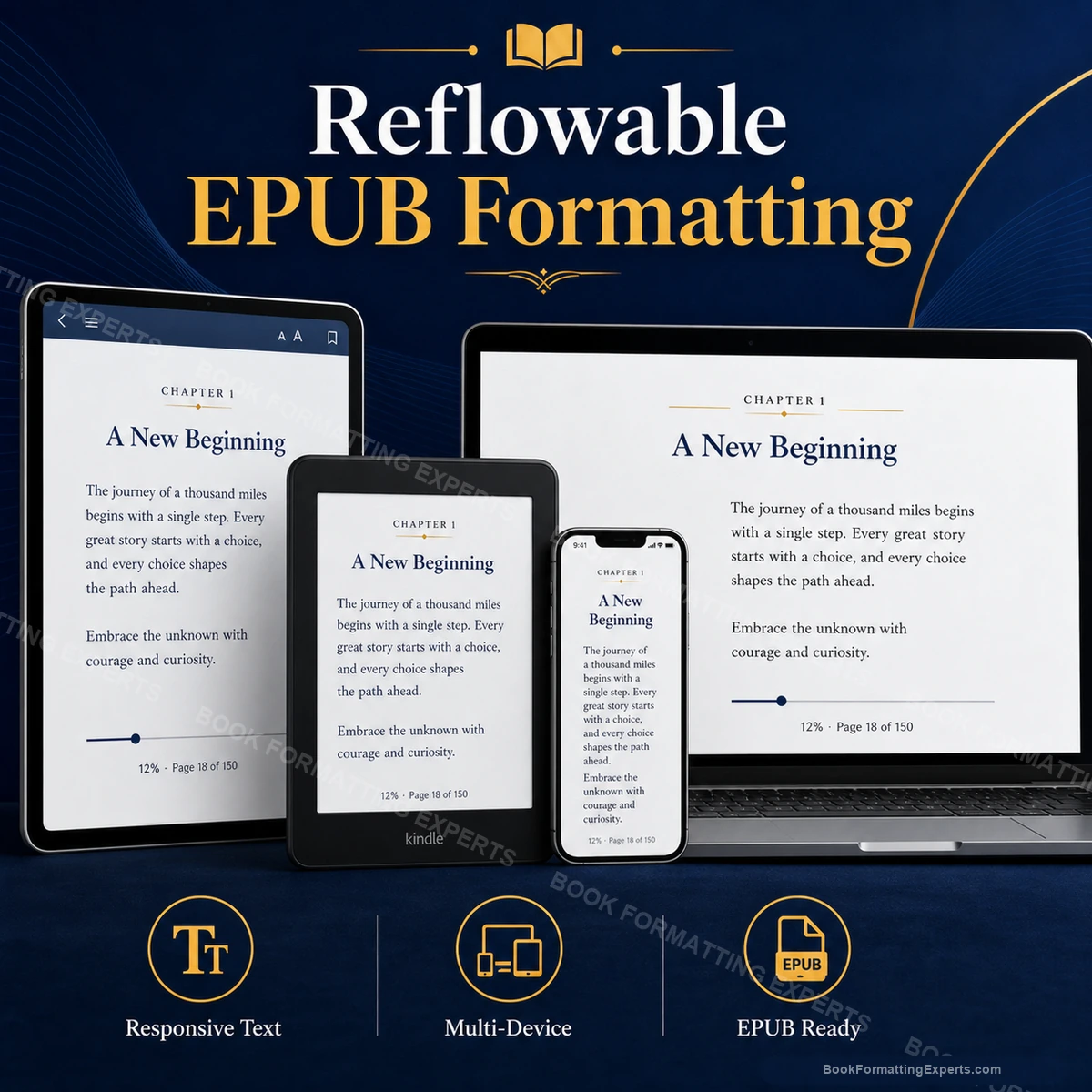
Reflowable EPUB Formatting sample showing reflowable epub formatting hero
174Reflowable interiors built
4.9Average client rating
6Reader settings every book is read at
0Fixed pixel sizes anywhere in the stylesheet
Definition

What Reflowable EPUB Formatting Actually Means

Reflowable means the text is poured, not placed. There is no page in the file, only a stream of content that a reading system arranges to fit whatever screen it finds itself on. Change the type size and the words rearrange. Rotate the device and they rearrange again. What you deliver is not a layout. It is a set of relationships that have to survive being rearranged.

This is why a beautifully designed print interior cannot simply be copied across. A drop cap that sits perfectly three lines deep at your settings will collide with the paragraph at somebody else's. An ornament centred on a page will orphan at the top of a screen. A photograph sized in pixels will fill a phone entirely and push your prose out of sight.

Reflowable EPUB formatting is the craft of designing something that holds its shape while its shape is being changed by a stranger. Everything is proportional. Everything has a fallback. And the only way to know that it works is to sit down with the book on real hardware and turn every dial the reader can turn.

The reader is holding the dial

The Six Settings That Break Most eBooks

Every reading system gives readers control over type size, typeface, line spacing, margins, screen brightness and background theme. Many of them also offer a switch, usually buried, that discards the publisher stylesheet entirely and renders the book in the reader's own defaults. A surprising number of people leave it on without knowing what it does.

A book formatted for one set of those settings is not really a book. It is a screenshot that happens to scroll. We build for the whole space of settings, and we check the corners of it, because that is where readers actually live and where one-star reviews are written.

1

Type size, from tiny to enormous

The same interior has to work at 8 points on a phone and at 28 points on an e-ink reader with poor eyesight behind it. Anything measured absolutely fails at one end or the other.

2

Theme, including dark and sepia

A black ornament on a transparent background disappears entirely in night mode. So does a scanned diagram with a white surround, which now sits in the text as a glowing rectangle.

3

Publisher styling switched off

The reader discards your stylesheet. What is left is the structure alone. If your chapter openers were only styling, the book collapses into an undifferentiated wall of text.

What Is Included

What a Reflowable Build Covers

Everything below is aimed at one thing: the book still behaving when somebody changes something.

Proportional typography throughout

Type scale, leading, indents, spacing above and below headings, and the depth of every chapter opener are all expressed relative to the body text. When a reader doubles the type size, the whole interior grows together in proportion instead of a chapter title staying stubbornly small while the prose swells around it.

Drop caps that degrade gracefully

Drop capitals are the most inconsistently supported thing in eBook typography. Ours are built so that a reading system which cannot float the letter renders a large, deliberate initial instead of a broken overlap. You get the effect where it works and something intentional everywhere else.

Scene breaks that never orphan

A scene break made of blank lines vanishes when it falls at the foot of a screen, and the reader loses the shift in time or point of view completely. Ours are real styled elements, with spacing that holds and a rule preventing them from being stranded alone at a screen edge.

Images that scale with the screen

Every picture is sized as a percentage of the viewport with a height cap, so a diagram takes a sensible portion of a phone and a sensible portion of a tablet without two separate files. Line art gets a background so it survives dark mode instead of dissolving into it.

Widow and orphan control inside reflow

You cannot control where lines fall in a reflowable book, but you can stop a heading being left alone at the bottom of a screen with its first paragraph on the next. The rules that do this are honoured unevenly, so we set them and then verify what each reading system actually did.

Hyphenation and justification tuned for e-ink

Justified text on a narrow e-ink screen with hyphenation switched off produces rivers of white space wide enough to drive through. We set the language attribute, allow hyphenation properly, and choose the alignment that suits your book rather than defaulting to whatever the tool did.

Portfolio

Reflowable Interiors We Have Built

Six recent books, each one read at six reader settings before it was allowed out.

Recent Work
Decide how much you are willing to give up

Design Control or Reader Control

This is the real trade in a reflowable book, and it is better faced at the start than discovered at the proof. Every piece of control you keep is one the reader loses, and readers notice when they lose it.

Hold the Design Tightly

Embedded fonts, a strong type scale, elaborate chapter openers, ornamental rules. Everything can be built, and on a good tablet it looks exactly as intended.

The cost is that any reader who prefers their own typeface, or who reads at 26 points, or who has publisher styling switched off, sees a book you never designed. The tighter the design, the further it is from what some of your audience will actually see.

Design for the Whole Range

A restrained, proportional interior that is defined by structure rather than by ornament. Chapter openers, breaks and hierarchy remain clear at any size, in any theme, with any typeface, and with the stylesheet discarded entirely.

It gives up a little grandeur at the top end and gains a book that is never embarrassing. For prose fiction and most nonfiction this is the right answer, and we will argue for it.

What We Fix

What Breaks When the Reader Turns the Dial

Six failures that are invisible at the settings a book was designed at, and unmistakable at everybody else's.

Drop caps that collideBuilt with a fixed offset, the initial letter sits neatly at one type size and overlaps the second line at another. On the systems that cannot float it at all, it simply crashes into the text.
Ornaments stranded at a screen edgeA scene break lands at the very foot of a screen. The reader turns the page, sees a new scene beginning, and never registers that anything changed.
Headings alone at the bottomA chapter subheading falls as the last line on the screen with its paragraph on the next. Reflow does this constantly, and nothing prevents it unless somebody wrote the rule.
Images that swallow the phoneA picture sized in pixels for a laptop fills an entire phone screen. The reader scrolls past a wall of image and has to hunt for where the text resumed.
Line art invisible in dark modeBlack diagrams and signature scans on transparent backgrounds vanish completely against a black theme. Nothing errors. The reader simply sees an empty gap.
Fixed pixel sizing anywhereOne absolute font size in the stylesheet overrides the reader's own choice. For a reader with low vision, that single line makes your book unreadable and unfixable.
Specification

The Reflowable Specification We Build To

Eight decisions, made the same way on every book, each one aimed at surviving a setting we do not control.

ElementHow we build itWhy it matters
Body text sizingSet at 1em with a line height between 1.4 and 1.6 and no absolute unit anywhere in the cascade.Any fixed size overrides the reader's preference. That is not a stylistic disagreement, it is an accessibility failure, and it is the fastest route to a review about eye strain.
Chapter opener depthSpace above a chapter title is set in em units, so it grows with the type rather than staying a fixed gap around enormous letters.A fixed opener gap looks generous at 12 points and looks like a mistake at 26, where the title fills the screen and the space above it has not moved.
Drop capitalsBuilt with a float and a line-height ratio tied to the body text, with a large-initial fallback declared for systems that ignore the float.Drop-cap support is the most inconsistent thing in eBook CSS. Without a fallback, the letter overlaps the second line and the paragraph is unreadable.
Scene breaksA styled block element carrying an ornament or spaced asterisks, with margins in em units and rules against being orphaned at a screen edge.Empty lines are collapsed by reading systems and disappear at screen boundaries. The reader then misses a change of scene, and the book stops making sense.
ImagesWidth set as a percentage of the viewport with a maximum height in viewport units, exported at twice the target density, alt text attached.A percentage-sized image behaves correctly on a phone and a tablet from a single file. A pixel-sized one is right on exactly one device and wrong on the rest.
Dark mode behaviourColour declared rather than assumed, transparent line art given a background panel, and every image checked against a black theme.Reading systems invert the background, not your artwork. Anything that relied on the page being white will vanish or glow, and no validator will mention it.
Justification and hyphenationLanguage declared in the package and in the markup, hyphenation enabled, and alignment chosen per book rather than left at the default.Justified text without hyphenation on a narrow e-ink column produces rivers of whitespace. The language attribute is what lets the device hyphenate at all.
Widow and orphan controlBreak rules applied to headings, subheadings and captions so they stay attached to what follows them.Support varies by reading system, so the rules are set and then the behaviour is checked on hardware rather than assumed. Set and unverified is the same as not set.
Checked Before Delivery

The Reader Settings Your Book Is Read At

Six configurations, all of them real, all of them chosen by real readers. Your book is opened in every one before it reaches you.

The largest type size the device offers

Everything that was going to break breaks here. Chapter openers overflow, drop caps collide, tables burst their columns and images crowd out the prose. If a book survives its largest setting, most of the rest of the range is already safe.

The smallest type on the narrowest phone

The opposite extreme, and it fails differently. Ornaments become specks, indents disappear into the margin, and the type scale between a heading and body text compresses until the hierarchy stops being visible at all.

Night mode and sepia

The background is inverted by the reading system and your images are not. Black line art disappears, scanned signatures glow, and any colour you chose against a white page is now being asked to work against a black one.

Publisher styling switched off

A setting many readers use without knowing it exists. Your stylesheet is discarded and only the structure remains. A book built on real semantics still reads correctly. A book built on visual styling collapses into one long undifferentiated column.

E-ink at a slow refresh

Justification, hyphenation and image dithering all fail first on e-ink. It is also where a heavy interior makes page turns sluggish, which readers describe as the book feeling broken even when they cannot say why.

A screen reader, start to finish

Reflowable is the only format where assistive technology works properly, and that only holds if the structure is real. Reading order, heading levels, alt text and language tags are stepped through with a screen reader rather than assumed.

Largest type sizeSmallest type sizeNight modeSepiaPublisher styling offLandscape rotationReader font overrideE-ink refreshScreen reader
Deliverables

What You Receive

The book, the source it was built from, and a written account of how it behaves where you cannot see it.

The reflowable EPUB 3 master

A validated, hand-coded reflowable file that uploads to every store taking EPUB. Proportional throughout, with no absolute sizing anywhere, and built so that the reader can do whatever they like to it without the book falling apart.

The stylesheet, readable and commented

A short, deliberate stylesheet you could open and understand. Every rule is there for a reason and the reason is written beside it. This is what makes changing an ornament in three years cost an hour rather than a rebuild.

The reader-settings report

A written record of how your book renders at each of the six settings we test, including anything a specific reading system does differently and what we did about it. No surprises arriving later from a reviewer.

The Kindle file, after Amazon has had its say

Amazon reinterprets a good deal of reflowable CSS during ingestion, particularly around margins and fonts. We build the derived file and look at it, so you approve Amazon's version of your typography before your readers meet it.

The screen-ready image set

Every interior image re-exported at high density, sized proportionally, given alt text and checked against a dark background. Line art comes back with a panel behind it so it survives night mode.

A handover note

One page explaining which decisions were made for reflow and why, which effects were deliberately kept restrained, and what would change if you ever moved the book to a fixed layout.

Process

How a Reflowable Build Runs

Five stages. The last one is the one nobody else does properly, and it is the reason the others matter.

01

Read the manuscript for structure

We go through the book looking for everything that has to survive reflow: chapter openers, scene breaks, epigraphs, letters, dream sequences, verse, block quotes. Each one becomes a named element rather than a visual effect, because only named things can be rebuilt at another size.

02

Set the proportional system

The type scale, the leading, the indents and the spacing are all defined relative to the body text. Nothing is chosen in pixels, and nothing is chosen because it looked right on the monitor it was designed on.

03

Build the interior

The markup is written, the stylesheet is written, the ornaments are drawn or chosen, the drop caps are built with their fallbacks, and the images go through the pipeline and come out proportional and dark-mode safe.

04

Turn every dial

The book is opened on real hardware and read at the largest and smallest type sizes, in night mode, in sepia, with the reader's own font forced, with publisher styling off, and in landscape. Everything that misbehaves is fixed in the stylesheet.

05

Proof, revise, deliver

You read the proof on your own device, at your own settings. Two rounds of notes are worked through, EPUBCheck runs to zero errors, and the master, the source, the images and the settings report are delivered.

Pricing Calculator

Reflowable EPUB Formatting Pricing Calculator

Pricing follows word count, because the length of the book determines how much of it has to be read back at each reader setting. The typographic ambition of the interior adjusts it from there.

Build Your Reflowable EPUB Formatting Quote

Required steps are marked with *. Optional extras can be removed from the summary with the cross icon.

Delivery
Total$0
1

Book Type *

Locked

What kind of reading experience we are building. This sets how many distinct elements have to survive reflow.

Novel or Literary FictionIncludedLong continuous prose, chapter openers, scene breaks and the occasional letter or diary entry. Fewer elements, but each one has to be right, because the reader is inside the book for hours.
Nonfiction, Memoir or Self-Help+$61Several heading levels, pull quotes, boxed exercises and lists. Every one of these has to remain distinguishable from the body text at the largest type size and with your stylesheet switched off.
Poetry, Academic or Reference+$119Verse with hanging indents, footnotes, tables and cross-references. The most demanding reflow there is, because line breaks and note relationships both have to survive a screen that keeps changing shape.
Illustrated or Fixed-Layout+$134Picture books and heavily designed titles where the image and the words must stay together on a canvas. This is the case where reflow is the wrong answer, and we will say so. The image count comes from the size you select, not from a separate step.
2

Book Size*

Locked

The word count of the finished manuscript, front and back matter included.

Up to 10,000 words+$149The word count of the finished manuscript, front and back matter included.
10,001 to 20,000 words+$195The word count of the finished manuscript, front and back matter included.
20,001 to 35,000 words+$255The word count of the finished manuscript, front and back matter included.
35,001 to 50,000 words+$325The word count of the finished manuscript, front and back matter included.
50,001 to 70,000 words+$405The word count of the finished manuscript, front and back matter included.
70,001 to 90,000 words+$499The word count of the finished manuscript, front and back matter included.
90,001 to 120,000 words+$605The word count of the finished manuscript, front and back matter included.
120,001 to 150,000 words+$729The word count of the finished manuscript, front and back matter included.
More than 150,000 wordsCustom QuoteLong novels, omnibus editions and reference works are quoted individually, because the settings matrix has to be run across the whole book rather than sampled. Send the manuscript for a fixed price.
3

Typography Package *

Locked

How much typographic ambition the interior carries, and which files you want alongside the reflowable master.

Reflowable master onlyIncludedThe validated EPUB 3, proportional throughout, tested at every reader setting. Upload it yourself to any store. This is genuinely all most prose books need.
Master plus Kindle file+$39Adds the derived Kindle file, checked in Previewer, so you see how Amazon has reinterpreted your typography before a reader does.
Custom typographic interior+$65Adds bespoke chapter openers, drop capitals with proper fallbacks and an ornament chosen or drawn for the book, all built to hold at every size.
Full reader-experience pack+$123Master, Kindle file, custom typography, the commented stylesheet, the screen-ready image set and the written reader-settings report. Everything, labelled.
4

Interior Complexity *

Locked

How many different kinds of element are in the book. Every distinct one needs its own class and its own pass at six reader settings.

Straight proseIncludedChapters, paragraphs, scene breaks and perhaps an epigraph. A small number of elements, each of which is taken through the full settings matrix.
Mixed elements+$52Heading levels, block quotes, lists, letters, boxed content and pull quotes. Each needs its own class, and each has to stay recognisable when the stylesheet is discarded.
Verse, notes and tables+$127Poetry with hanging indents, bidirectional footnotes, tables that must fold on a phone, and captions that stay attached to their figures through every reflow.
5

Interior Images *

Locked

How many pictures sit inside. Each one has to scale proportionally and survive a dark background.

No interior imagesIncludedText only. The cover is handled separately and is not counted here.
1 to 15 images+$31Each sized proportionally, exported at high density, given alt text and checked against a dark background as well as a light one.
16 to 40 images+$77A properly illustrated interior. At this count the placement of each image relative to the text has to be checked at the largest type size, where images and prose start competing.
41 to 90 images+$139Heavy illustration inside a reflowable book, which is a real design problem. Every image is placement-tested individually, because reflow moves them all and moves them differently on each device.
More than 90 imagesCustom QuoteAbove this count a reflowable interior is usually fighting itself, and the honest conversation is about whether the book should be fixed-layout instead. Tell us the count and we will tell you which.
6

Delivery Speed *

Locked

Standard is the pace at which the whole settings matrix can be run. Faster tiers buy queue position, never fewer checks.

StandardIncludedThe normal queue, with the full reader-settings matrix run across the whole book rather than sampled. This is the pace at which the testing is real.
Priority+$88Around a third off the window you were quoted. You move up the queue, and every setting is still opened and read exactly as it would have been.
Express+$168About half the standard window. Appropriate when a launch date is already public and the cover is already out in the world.
Rush+$268The fastest we will move while still reading the book on hardware at both type extremes. You get one revision round, not two.
7

Revision Rounds *

Locked

Two rounds are included. On a reflowable book they are usually about taste, because the behaviour was settled during testing.

2 Revisions IncludedIncludedTwo full rounds once you have read the proof at your own settings. Anything that misbehaves at a reader setting is our error and is fixed outside your rounds.
2 Additional Rounds+$72Four rounds in total. Useful when a proofreader is still working, or when a co-author has strong feelings about ornaments.
5 Additional Rounds+$148Seven rounds in total. For books going through a formal approval chain, and for authors who like to see a thing five ways before choosing.
8

Optional Extras

Locked

Typographic and accessibility work that goes beyond a straightforward reflowable interior.

Bespoke scene-break ornament+$46An ornament drawn for your book rather than chosen from a font, exported at every density, given a dark-mode panel and prevented from orphaning at a screen edge.
Drop-cap system with fallbacks+$58Drop capitals built to hold their proportion at any type size, with a large-initial fallback for the reading systems that will not float them at all.
Dark-mode image treatment+$69Every piece of line art, diagram and signature given a background treatment so it stays visible against a black theme instead of dissolving into it.
Verse and hanging-indent build+$84Poetry set as real line-level markup, with runover lines indented under themselves so a long line wraps as a continuation rather than pretending to be a new line.
Hyphenation and justification tuning+$93Language attributes declared, hyphenation enabled, and alignment tested on a narrow e-ink column until the rivers of whitespace are gone.
Reader-settings report+$106A written account of exactly how your book renders at each tested setting on each tested device, with screenshots, so you know what your readers are seeing.
Accessibility metadata and audit+$116Full accessibility metadata plus a screen-reader pass through the whole book, checking reading order, heading levels, alt text and language changes. Increasingly required by libraries.
Embedded font setup with fallbacks+$157Licence checked, fonts subset to the glyphs used, and a fallback stack behind each family, so your typeface survives contact with the reading systems that strip it.
Series typographic standard+$183A documented, proportional interior standard you own, so every future book in the series behaves identically at every reader setting without rediscovering the measurements.
Fixed-layout companion edition+$217The same book also built as a fixed-layout EPUB, for the titles that genuinely want both. You get the reflowable file for readers and the fixed one for the design.
Request Your Custom Quote
You selected a custom or advanced option, so this project is priced individually rather than through checkout. Send us the details and we will scope it properly.

This covers the reflowable interior and how it behaves. Editing, proofreading, cover artwork, ISBN registration and uploading to your retailer accounts sit outside it. We do not change a word of your text, only the structure that carries it.

Compare

Built for One Screen Against Built for Every Setting

Both files look correct on the machine they were made on. Only one of them is still correct in a stranger's hands.

What you are comparingFormatted for the Designer's ScreenBook Formatting Experts
Type sizing Fixed pixel values, so the reader's own size preference is overridden and low-vision readers are locked out entirely. Everything relative to the body text, so the interior scales in proportion whenever the reader changes anything.
Drop caps A float with a fixed offset. Correct at exactly one type size, colliding with the second line at every other. Built proportionally with a declared fallback, so it either works or degrades into a deliberate large initial.
Scene breaks Blank lines, which reading systems collapse and screen edges swallow. The reader misses the break entirely. Real styled elements with proportional spacing and rules preventing them from being orphaned at a screen boundary.
Dark mode Never opened in it. Black line art vanishes and white-backed scans glow in the middle of the prose. Checked against a black theme, with every transparent image given a treatment that keeps it visible.
Publisher styling off Never tested. The book collapses into a single undifferentiated column, because the hierarchy was only ever visual. Read in that state deliberately. The structure is real, so the hierarchy survives with the stylesheet gone.
What testing means Opened once in a desktop previewer at the default settings and pronounced finished. Read on real hardware at both type extremes, in two themes, with the reader's font forced, and in landscape.
Who This Is For

What Reflow Demands of Each Kind of Book

Every genre stresses a different part of the reading experience.

Novels and literary prose

Hours of continuous reading, which means the small things compound. An indent that is fractionally wrong, a scene break that occasionally vanishes, a chapter opener that swells oddly at large type. Individually invisible, and together they are what readers mean when they say a book felt cheap.

Business, self-help and how-to

Callouts, frameworks, numbered steps and boxed exercises. Reflow removes the concept of beside, so every sidebar becomes an interruption in the flow, and it has to remain visibly different from the body text even when the reader has discarded your stylesheet.

Poetry and verse

The hardest thing to reflow. The line is the unit of meaning, and reflow wants to reflow it. Verse needs real line-level markup and a hanging indent for runover lines, so that at 26 points a long line wraps under itself rather than passing itself off as a new one.

Memoir and life writing

Letters, journal entries, quoted documents and photographs, each of which has to read as different from the narrative at any type size. The photographs are usually the problem, because they arrive as scans that vanish or glow the moment somebody switches to night mode.

Academic and reference

Footnotes that must link both ways through a book with no pages, tables that have to fold gracefully onto a phone, and figure captions that must stay attached to their figures through every reflow the reader triggers.

Children's chapter books

Larger type by default, frequent illustration and short chapters. The trap is that the reader may enlarge the type further still, at which point a picture sized for a comfortable ratio suddenly dwarfs the two sentences it was illustrating.

Standards

Why We Read Your Book Six Times

A reflowable book cannot be checked by looking at it once. It has no single appearance to check. It has a range of appearances, and the only honest way to know it works is to go to the edges of that range and read what is there.

So we do. Largest type, smallest type, night mode, sepia, reader font forced, publisher styling off. It is slow and it is the whole point, because your reader will pick one of those settings on their first evening with the book and never think about it again.

Three Rules of Reflow

1

Nothing absolute, anywhere

One fixed pixel value in the stylesheet is enough to override a reader's own choice. It is the single most common fault in eBook CSS and the one with the worst consequences for the people it affects.

2

Every effect needs a fallback

Drop caps, ornaments, embedded fonts and break rules are all supported unevenly. Build them so that failure is a plain, deliberate outcome rather than a visible mess.

3

Structure has to survive the stylesheet

Turn your CSS off and read what is left. If the chapter openers, the breaks and the hierarchy are still legible, the book is built properly. If it collapses, the design was decoration on top of nothing.

Quality Control

The Reflow Checklist

Twelve checks, run at the extremes of the reader settings rather than at the defaults.

No absolute font size or fixed pixel measurement exists anywhere in the stylesheet
The interior holds at the largest type size the device offers
The hierarchy is still visible at the smallest type size on the narrowest phone
Drop capitals hold their proportion, or fall back to a deliberate large initial
Scene breaks are visible and never stranded alone at the foot of a screen
Headings stay attached to the paragraph that follows them
Every image scales to the viewport and none of them fills a phone screen alone
Line art and transparent images remain visible against a dark theme
The book reads correctly with publisher styling switched off entirely
Language is declared, hyphenation works, and justified text has no rivers on e-ink
The final package clears EPUBCheck with no errors at all
The whole book has been read on physical e-ink and on a phone, not only in a previewer
Before We Start

Who Needs Reflowable EPUB Formatting

Six situations where the reading experience, rather than the file, is what has gone wrong.

Your reviews mention the formatting

The story is fine and the reviews are still complaining. Almost always this is a reader setting you never tried: a size, a theme or a font override at which your interior stops behaving. It is fixable, and the fix is usually cheaper than the damage already done.

Readers with low vision cannot use your book

Someone has written to say they cannot enlarge the type, or that it enlarges and the layout falls apart. There is a fixed pixel value in your stylesheet, and until it comes out, a substantial part of your potential audience simply cannot read you.

You care about how the book feels to read

The prose has been worked on for years and you are not prepared for it to arrive on a screen looking like a printout. Reflowable typography is a real craft, and the difference between careless and considered is felt over hours rather than seen in a screenshot.

You want a print-quality feel on a screen

Drop caps, ornaments, real scene breaks and a proper type scale, but built so that they still hold when the reader takes over. This is possible. It just cannot be done by copying the print interior across.

You are selling to libraries or institutions

They will check whether your book is genuinely readable with assistive technology, and a reflowable file with real structure is the only kind that passes. Fixed layout and visual-only hierarchy both fail, and they fail before anyone reads a word.

Your book has to work everywhere

Kindle, Apple Books, Kobo, Nook, Google Play, library platforms, and every one of them with a different renderer and a different set of reader controls. A book built for one of them is a book that disappoints on the other five.

Our Promise

What We Guarantee About the Reading Experience

Three promises, each of which you can test yourself in about ten minutes.

No fixed sizing, anywhere

Open the stylesheet we deliver and search it. You will not find an absolute font size. Every reader keeps full control of the type, which is the one thing a reflowable book must never take away.

It holds at both extremes

Set your device to its largest type size and then its smallest, and read a chapter at each. If anything in a book we built collides, vanishes or falls apart, tell us and we will fix it, whenever you find it.

It survives your stylesheet being discarded

Switch publisher styling off and read. The hierarchy is still there, because it was built into the structure rather than painted on top of it. That is the test that separates a formatted book from a decorated one.

Strategy

How We Think About a Reflowable Interior

Three principles that settle nearly every argument during a build.

Design for the reader you will never meet

They read at 22 points in night mode on a five-year-old e-reader with your typeface stripped out. They are not a fringe case, they are thousands of people, and the book has to be good for them too.

Proportion, never position

Nothing in a reflowable book can be placed. Everything has to be related to something else, so that when the reader changes one thing, everything else moves with it rather than against it.

Restraint outlasts ornament

The interiors that still look right in five years are the restrained ones. Elaborate effects depend on support that changes, and every one of them is a thing that can break in a stranger's hands.

The Short Version

The Reflow Framework

Three tests, applied to every element before it is allowed into the book.

1

Does it scale

Take the type from smallest to largest and watch what this element does. If it grows in proportion with everything around it, it stays. If it holds still while the text swells past it, it is rebuilt in relative units.

2

Does it degrade

Turn off the support it depends on. A drop cap that cannot float, an embedded font that is stripped, a break rule that is ignored. What is left has to look like a decision, not like an accident.

3

Does it survive without the stylesheet

Discard the CSS entirely and read what remains. If a scene break, a chapter opener or a pull quote disappears at that point, it was never structure. It was decoration, and it gets rebuilt as structure.

Client Reviews

What Authors Say After the Files Land

Rated 4.9 out of 5 across 174 reviewed projects.

★★★★★

I had already paid someone else to format this book once. The chapter headings shifted every time a reader changed the font size and I only found out from a review. This team rebuilt the interior from the structure up and sent me photographs from four real devices before I uploaded anything. First launch day I have not spent refreshing the reviews in a panic.

MW
Marianne WhitlockUnited Kingdom Verified
★★★★★

What sold me was the audit. They came back and told me two chapters had been pasted in from another document and were carrying invisible styles, and that fixing that first would save me money later. Nobody had mentioned it in three years of self-publishing. The proof needed no corrections at all.

DA
Devon AchebeUnited States Verified
★★★★★

My book has footnotes, tables and two appendices, and every quote I got either ignored that or doubled the price because of it. Here the pricing was laid out step by step and I could see what each element cost before I committed. It arrived early and the notes link both ways, which nobody else had even offered.

SL
Suvi LehtinenFinland Verified
★★★★★

The proof came back from the printer with the margins exactly where they should be, the running heads correct, and not one chapter opening on a left-hand page. This is my fourth book and the first time I have not had to pay for a second proof copy.

RO
Rachel OkonjoCanada Verified
★★★★★

English is my second language and I was nervous about the back and forth. Everything was explained plainly, and when I asked the same question twice they answered as if it were the first time. The revisions were turned round inside two days and I was never made to feel like a nuisance.

TI
Tomas IglesiasSpain Verified
★★★★★

I write cookbooks, so the interior is the product. Ingredients have to sit beside the method or the recipe stops working, and the last person I hired reflowed the whole thing into nonsense. These people understood the problem before I had finished describing it and the finished layout is genuinely beautiful.

PR
Priya RaghunathanIndia Verified
★★★★★

Straightforward from beginning to end. A fixed price, a delivery window they actually hit, and files that went up to KDP and IngramSpark without a single rejection. I have since sent them two more titles and recommended them to my writing group without hesitation.

GN
Gregory NkemeluNigeria Verified
★★★★★

My memoir has photographs and I had resigned myself to them looking muddy. They optimised every image, told me honestly which two were too low-resolution to save, and suggested crops instead of shrugging. That candour is worth more to me than the discount I was chasing elsewhere.

HS
Hannah SorensenDenmark Verified
★★★★★

I sent them a 480-page reference book with a nightmare of cross-references and a table on nearly every spread. They quoted it accurately, they did not come back later asking for more money, and the index still works. Any author will tell you what that is worth.

EB
Elliot BarrowAustralia Verified
FAQ

Reflowable EPUB Formatting Services — Your Questions, Answered Properly

The questions authors actually ask us, answered without sales language.

What is reflowable EPUB formatting, and how is it different from fixed layout?

Reflowable EPUB formatting builds a book as a stream of structured content rather than as a set of pages. The reading system arranges the text to fit whatever screen it lands on, and the reader controls the typeface, the size, the margins, the spacing and the background. Fixed layout does the opposite: every element is placed on a canvas of a known size and nothing moves. Reflowable is right for nearly all prose. Fixed layout is right when the relationship between image and word on a page is the point of the book.

Why can a reader change my fonts and sizes at all?

Because they own the reading experience and the specification is built around that. This is not a flaw to be worked around, it is the reason eBooks are readable by people who cannot read print. A reader with low vision sets the type to 26 points. A commuter reads at 11 on a phone. Someone with dyslexia switches to their preferred typeface. Your interior has to be good in all three situations, and any design that only works at your settings has quietly excluded a lot of people.

What actually breaks when someone enlarges the type in an eBook?

The things that were measured rather than related. A chapter opener with a fixed gap above it keeps that gap while the title swells to fill the screen. A drop cap with a fixed offset collides with the second line. An image sized in pixels stays the same while the text around it doubles, so it shrinks into insignificance or, on a phone, dominates everything. A table bursts its columns. Everything we build is expressed relative to the body text precisely so that none of this happens.

How do you make drop caps work across different reading systems?

By building them proportionally and giving them somewhere to fall. A drop cap is a floated letter whose height is tied to the line height of the body text, so it stays three lines deep whatever size the reader chooses. Support for that float is genuinely inconsistent, so we declare a fallback: on a system that will not float it, the reader gets a large, deliberate initial capital instead of a letter overlapping the sentence. You get the effect where it works, and something intentional everywhere else.

Will my scene-break ornaments survive on every device?

They will if they are real elements rather than empty lines, which is the mistake almost every do-it-yourself interior makes. Blank lines get collapsed by reading systems and swallowed at screen boundaries, so the reader turns a page, finds a new scene underway and never registers that anything shifted. We build breaks as styled blocks with proportional spacing, and we set rules that prevent them being stranded alone at the foot of a screen, then we check what each reading system actually did with those rules.

Does my eBook work in dark mode, and what do I need to know about it?

It works, but your images may not, and no validator will ever tell you. The reading system inverts the background and leaves your artwork alone. Black line art on a transparent background disappears completely against a black page. A scanned signature or diagram with a white surround becomes a glowing white rectangle sitting in the middle of your prose. We check every image against a dark theme and give the ones that need it a background treatment, so the book is legible whichever way round your reader has it.

What are relative units and why does it matter that you use them?

A relative unit expresses a measurement as a ratio of something else, usually the body text size, rather than as a fixed number of pixels. Set an indent at 1.2em and it grows when the reader grows the type. Set it at 20 pixels and it does not, so at a large size it becomes an invisible nudge and at a small size an enormous gutter. The same logic applies to every space, every heading and every ornament. A reflowable book with fixed measurements in it is not really reflowable, it is a layout that happens to rearrange.

Can I control widows and orphans in a reflowable book?

Partly, and honesty is required here. You cannot control where lines fall, because you do not control the screen or the type size, so a widow at the bottom of one reader's screen is mid-paragraph on another's. What you can control is whether a heading is allowed to be left alone at the foot of a screen with its first paragraph on the next, and whether a caption can be separated from its figure. Those rules exist, they are honoured unevenly, and we set them and then verify on hardware what each system actually did.

How do images behave when the text reflows around them?

They do not flow around anything, and it is better to accept that early. Text wrap in a reflowable book is unreliable and looks wrong the moment the reader changes anything. Instead, images sit in the flow as blocks, sized as a percentage of the viewport with a cap on their height, so they occupy a sensible proportion of a phone and a sensible proportion of a tablet from a single file. Where a picture genuinely needs to stand alone, it gets its own break, so it never lands halfway through a sentence.

What is publisher styling, and why do you test with it switched off?

Most reading systems have a setting, usually not prominent, that discards the book's stylesheet and renders it in the reader's own defaults. Plenty of people leave it on without ever knowing what it does. When it is on, everything you paid for in the visual design is gone, and only the structure remains. A book built on real semantics still reads correctly, because a heading is still a heading. A book built on visual styling collapses into one long undifferentiated column of text. We read every book in that state before delivery.

Should a cookbook or an illustrated book be reflowable or fixed?

It depends on whether the picture explains the words or is the point of the page. A cookbook where each photograph illustrates a recipe usually works reflowably, and it should, because readers hold cookbooks on phones in kitchens and need to enlarge the ingredients. A cookbook where the food photography bleeds across a spread with type placed on it will not survive reflow, and forcing it to is a slow way to ruin the design. We will look at your book and argue for one, with reasons.

How do you handle hyphenation and justification on an e-ink screen?

Carefully, because e-ink is where this fails hardest. A narrow column, justified, with hyphenation disabled, produces rivers of white space wide enough to distract from the sentence. The device can only hyphenate if the language is declared, and a surprising number of eBooks never declare it. We set the language attribute in the package and in the markup, enable hyphenation properly, and then choose between justified and ragged-right per book after looking at it on an actual e-ink screen rather than guessing.

Can I use my own typeface in a reflowable book?

Where the licence permits embedding, yes, and with two caveats worth knowing before you get attached to the idea. Some reading systems strip embedded fonts in some contexts, so a fallback stack has to sit behind every family or your reader gets whatever the device felt like. And many readers override your typeface with their own preference regardless, which they are entitled to do. Your interior therefore has to look intentional in your typeface and in theirs, which means the hierarchy cannot depend on the font.

Why does my book look different on Kindle than it did in my previewer?

Because Amazon converts your EPUB into its own internal format during ingestion, and that conversion reinterprets a good deal of reflowable CSS, particularly around margins, indents and fonts. It is not a fault in your file, it is the platform. The answer is to write the interior so it degrades sensibly rather than depending on any single rule being honoured, and then to look at the converted file in Kindle Previewer before publishing so you know exactly which of your decisions Amazon has overruled.

How do you keep tables usable when the reader enlarges the text?

First by asking whether it needs to be a table, because a great many are lists wearing a grid and behave far better as lists. Where the data is genuinely tabular, it is built as a real table with header cells and then read at the largest type size on the narrowest screen we own, which is the moment of truth. If it bursts, we restructure it into a stacked, labelled form where each row becomes a small block. A reader who gets the data beats a reader who gets a horizontal scroll bar.

Is reflowable formatting better for accessibility?

It is the only format that works properly. A screen reader needs real structure to follow, and a reader with low vision needs to be able to enlarge the text without the layout collapsing. Both of those are exactly what a well-built reflowable book provides and exactly what a fixed layout cannot, since fixed layout is a picture of a page. This is also why libraries, universities and several jurisdictions now require reflowable, structurally sound files before they will buy a title at all.

What happens to poetry and verse when the text reflows?

Left to itself, it is destroyed, and this is the case we care most about getting right. Reflow wants to treat a line as a fragment of a paragraph, but in verse the line is the unit of meaning. We set poetry as real line-level markup, so each line is a line, and we give runover lines a hanging indent, so that when a reader enlarges the type a long line wraps beneath itself as an obvious continuation rather than masquerading as the next line of the poem.

Can a reflowable eBook look as good as a printed book?

It can look considered, coherent and clearly designed, and at a good tablet at sensible settings it can look genuinely beautiful. What it cannot do is look identical for everyone, because everyone is holding a different page. The right ambition is not to reproduce the print interior but to carry its character into a form the reader controls. Books that try to reproduce a printed page inside a reflowable file end up worse than either, and that is the mistake we spend most of our time talking authors out of.

What does the reader-settings report tell me?

It tells you what your readers are actually seeing, which you otherwise have no way of knowing. It records how the book renders at each setting we test, on each device we test on: largest and smallest type, night mode, sepia, reader font forced, publisher styling off, landscape. Where a particular reading system does something unusual, that is noted along with what we did about it. It is the difference between hoping your book behaves and being able to point at evidence that it does.

Can you fix an existing reflowable eBook that misbehaves at certain settings?

Yes. Rescuing a reflow that has gone wrong is a steady part of our week. Send us the file and tell us what you or your readers have noticed. Most of these repairs come down to a small number of causes: absolute sizing in the stylesheet, drop caps or ornaments with no fallback, images sized in pixels, blank lines standing in for scene breaks, and a stylesheet so bloated by a converter that nothing in it can be reasoned about. All of them are fixable, and usually for considerably less than a rebuild.
Next Step

Send Us the Manuscript and Tell Us How You Want It to Feel

We will read it, tell you which effects will hold at every reader setting and which ones will let you down, and give you a fixed price and a real date. If your book wants restraint rather than ornament, we will say so.

$00 items selected
No options selected yet.
Get a Quote